
Design Serves a Purpose
Every design decision should answer one question: does this help the visitor take the action we want them to take? If the answer is “it looks cool” but not “it drives conversions,” it’s the wrong decision.
Clarity Beats Cleverness
The #1 conversion killer is confusion. If a visitor can’t understand what you do and how to take the next step within 5 seconds of landing on your site, you’ve lost them. This means:
- Clear headlines that state exactly what you offer
- Visible CTAs that tell visitors exactly what to do next
- Simple navigation that gets people where they need to go
- No jargon unless your audience expects it
Visual Hierarchy Guides the Eye
Good design creates a clear path for the eye to follow. The most important element (usually your headline or CTA) should be the most visually prominent. Use size, color, contrast, and spacing to create hierarchy:
- Primary action (CTA button) — highest contrast, largest target
- Supporting headline — clear value proposition
- Social proof — testimonials, logos, metrics
- Secondary content — features, details, FAQs
Speed Is a Design Decision
A page that loads in 1 second converts 3x better than one that loads in 5 seconds. Performance isn’t just a developer concern — it’s a design constraint. Every large image, custom font, and animation has a cost. The best designs achieve their visual goals while staying fast.
Trust Signals Are Non-Negotiable
Visitors make trust judgments within milliseconds. Effective trust signals include:
- Client logos (especially recognizable brands)
- Testimonials with real names and photos
- Specific metrics (“350+ websites managed” vs “many clients”)
- Professional photography over stock images
- Clear contact information and physical address
Mobile Isn’t Secondary
60%+ of web traffic is mobile. A responsive design isn’t enough — the mobile experience should be designed intentionally, not just reflowed from desktop. Touch targets need to be large enough, forms need to be simple, and the path to conversion needs to be even clearer on a small screen.
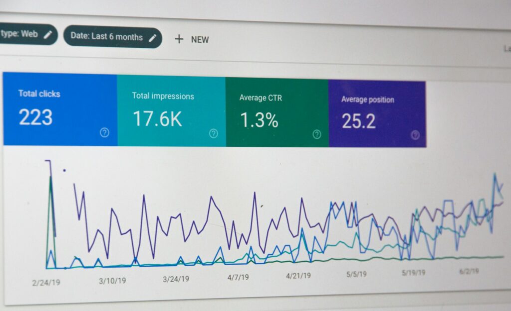
The Data-Driven Approach
Good design isn’t guesswork. We use heatmaps, scroll depth analytics, and A/B testing to validate design decisions. What looks right to a designer isn’t always what performs best for users. Let the data guide the iteration.